Hey {{first_name}},
If you want customers to buy now and buy more in 2026, there’s one area you can’t afford to ignore.
And the area I am referring to is your navigation.
How fast can a customer go from “I’m looking for X” to “I’ve found exactly what I want (and a bit more)”?
We’ve recently run 3 A/B tests around navigation/signposting.
Because when you make it easier for people to find the right products, you tend to increase your Conversion Rate (CR) AND your Average Order Value (AOV).
Here are three recent A/B tests:
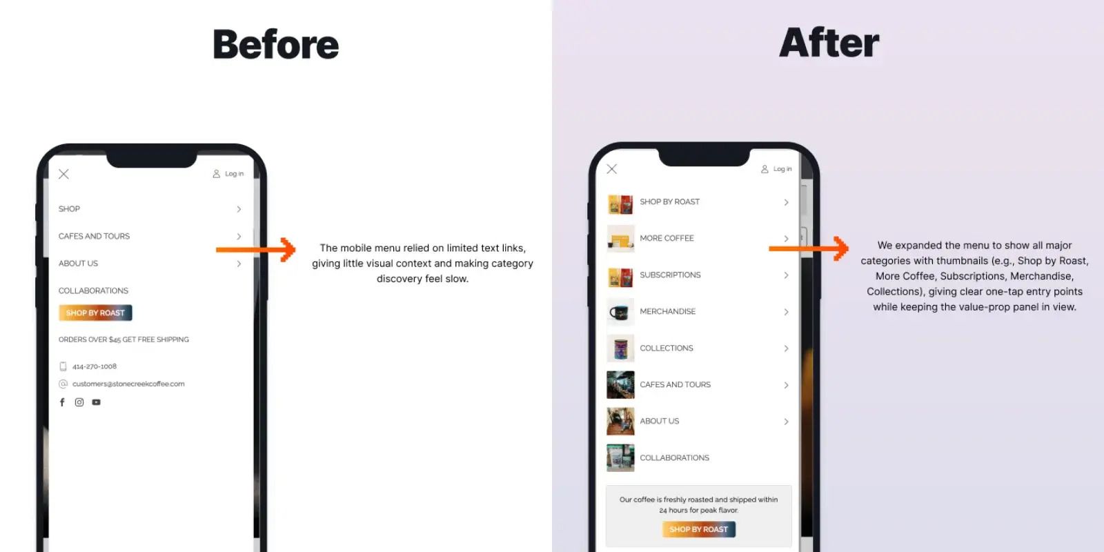
Mobile is where the majority of traffic is, and yet the mobile menu is usually treated like a junk drawer.
In this test, we:
Reordered the menu around shopping intent instead of internal categories
Surfaced “Shop by problem / use case” options
Cleaned up labels and removed noisy links

Results:
+18% increase in CR
+8% increase in AOV
See the full test breakdown here 👉 https://blendcommerce.com/blogs/ab-tests-shopify/redesign-mobile-menu
2. Story Widgets
Here, we added an Instagram story-style widget to key pages to guide people based on their current stage in the journey.
The aim is to reduce cognitive load, improve scannability, and guide users into the correct subcategories more quickly.

Results:
385% increase in Subscription Revenue / Visitor
11% increase in CR
See the full test breakdown here 👉 https://blendcommerce.com/blogs/ab-tests-shopify/utilising-story-widgets
3. Sub-Category Widgets
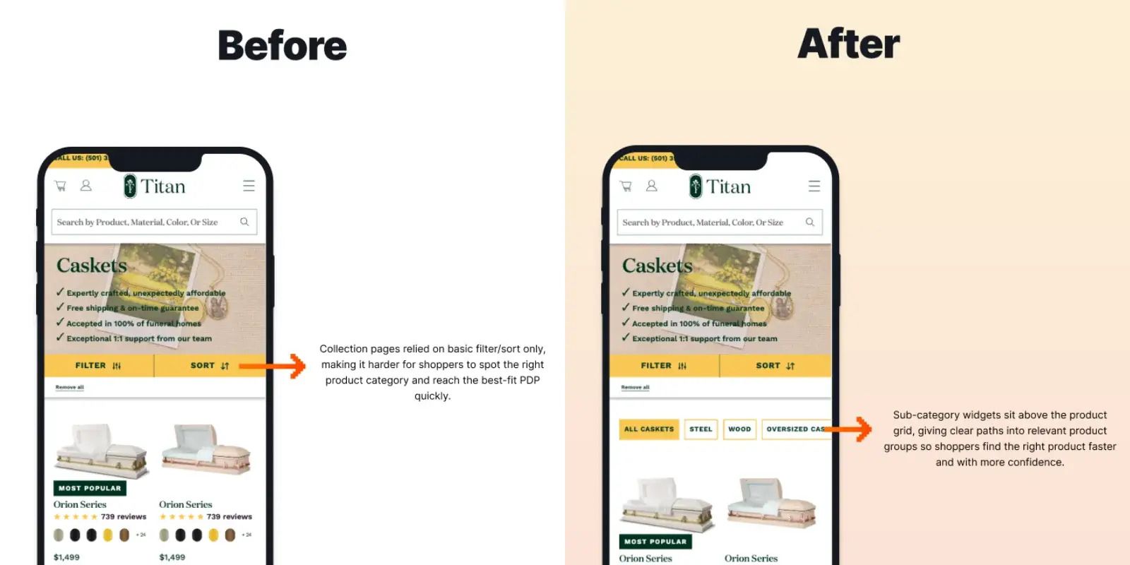
Here, the focus was: once someone hits a collection, how easy is it for them to refine and find “the next logical item”?
This A/B test placed sub-category widgets directly above the product grid, strategically positioned to catch high-intent visitors before they scrolled.
Introducing clear pathways into key product groups.

Results:
+31% Increase in Revenue per Visitor
+8% increase in Add to Cart
See the full test breakdown here 👉 https://blendcommerce.com/blogs/ab-tests-shopify/utilising-sub-category-widgets
Chat soon,
Peter

